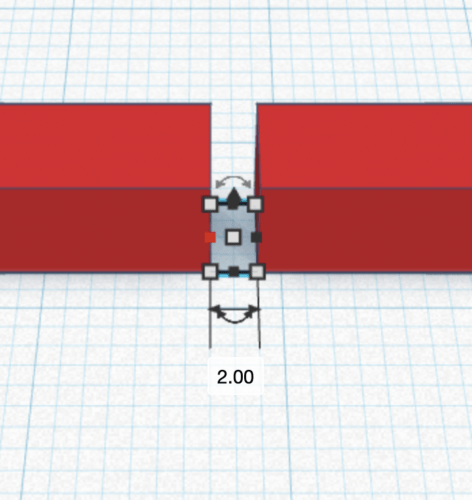
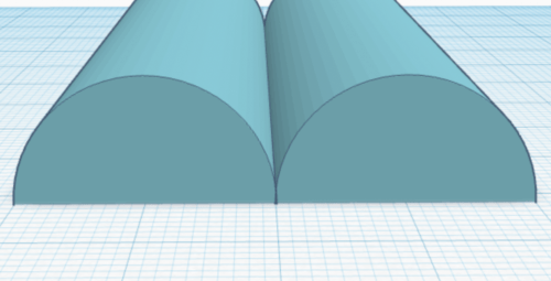
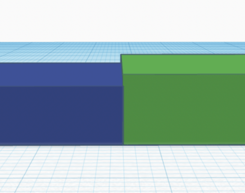
When exploring a 3D model by touch, it is important to be able to distinguish the shapes and features of different objects. If there is not enough space between two objects the user will experience them as one, missing out on the intended information provided by the shape and/or features. It is important to use a minimum distance between objects to provide an accessible and efficient way of exploring the model and making sure all the information can be experienced by the user with a visual impairment.
There are many different types of shapes and ways of introducing information into a tactile object. They can be added on top or cut out to create a negative shape in the model. The most common shapes are round, square, have an organic shape or a combination of these shapes. This article will provide a general guideline that combines lots of variable combinations into a baseline which will work in most situations with most models. However, it is still important to test with end-users as their experience might be different or the situation may require a different solution. We have tested several different models with multiple students in order to gain an understanding on a general tactile strategy and what distance works best.
2mm is the minimum distance required between two objects for a clearly distinguished tactile experience. 1mm is the absolute minimum.
Rounded shapes offered a higher distinguishability between objects because they provided greater tactility and have a variation of distance within the objects. The distance between the objects should be measured at the highest rounding point of the object.
Using a different height for each object also provided a clearer difference between objects. Even when there was no distance between the objects, the user was still aware that there were two different objects within the model. We recommend using the same difference in height as the distance between two models. 2mm is a distance that will work well in most cases; 1mm is the minimum that can be distinguished.
Bringing multiple guidelines together will provide the best experience. For example: using rounded shapes, a 2mm distance and a height difference will provide a very clear differentiation between the models. More complex shapes, surfaces or models will require more distance between the objects and larger rounded shapes. This also applies when there are a lot of objects close to each other that need to be distinguished. This situation will require higher values than the minimum specified in these guidelines.
Lastly, it is important that the user understands the goal of each identified object within the model and why it is there. This may require some additional information to be provided to the user. If the user doesn’t see a reason why it’s a separate object, they won’t experience it that way.
The distance from Braille to lines on a model is described in Article 3.7 Labeling with Braille.


